I’ve been testing DC Desktop 1.43 since wednesday and haven’t found any bugs so far.
Apart from the already known problem with the icons for muted accounts.
The new account switcher is awesome! I also like the many improvements and the funny idea of showing a fireplace when deleting an account.
The app also looks nicer and more modern than before. ![]()
While testing, I came up with a few ideas on how to make DC Desktop even better.
These are mainly small design changes and are of course completely subjective.
Other users will probably criticize these ideas.
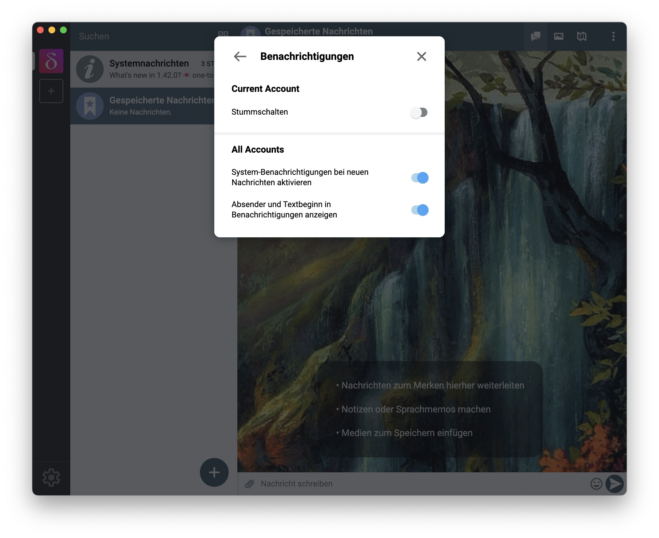
Display email addresses in account switcher
If the user moves the pointer over an account, the name and connection status appear.
I think it would make sense to also display the email address.
Some users probably use the same name for multiple accounts.
Profile pictures can also change over time.
The email address as additional information would certainly be helpful in such cases.
In addition, this has been the case so far.
The address is not displayed in DC-iOS.
That’s why I’ve wanted to write a proposal for a while.
But the situation is more difficult because there is less space available.
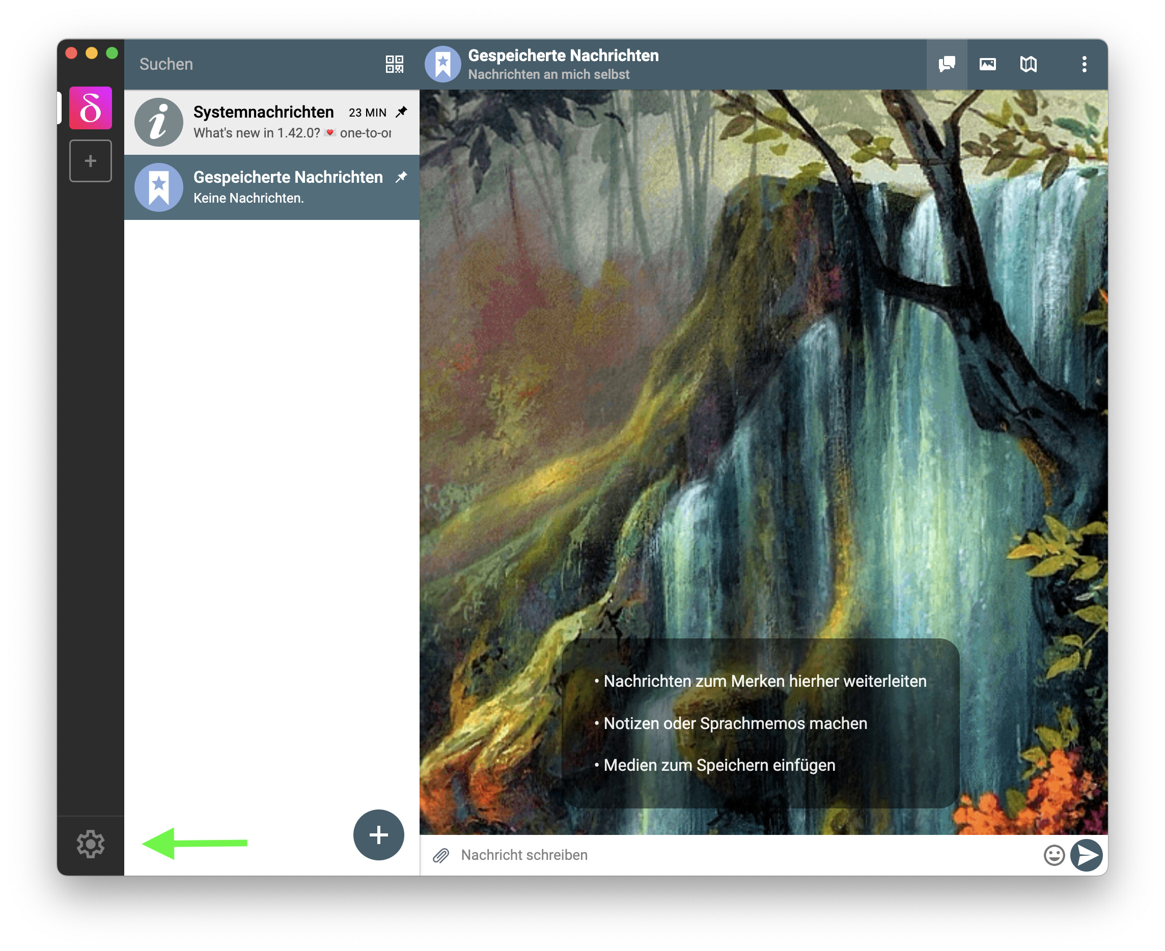
Different color for the account switcher in light mode
In my opinion, the dark gray of the account switcher fits visually very well with all themes except the light theme. In this case, the contrast to the rest of the UI is too high.
Maybe the same color as in the bar could be used in light mode or a slightly darker one to highlight the switcher more.
In these example images the settings icon is smaller and the account switcher is slightly wider.


Slightly wider account switcher
I’m referring to DC for macOS and I don’t know to what extent this applies to other operating systems.
If the account switcher would be two pixels wider, the three colored window management dots would be right in the middle of the switcher. Admittedly, this is a very small detail, but I think it would just make it look more symmetrical.
Slightly smaller settings icon
The icon is well placed, but in my opinion it is a bit too big compared to other icons.
In this example image the icon has been reduced to 56 x 56 Pixel.
Background color for transparent parts of a profile image
Round profile images have been a standard for many years.
If a round image is displayed in the account switcher, the transparent parts are simply colored white.
I think it would look better to use the background color in such cases.
Higher contrast between the selected and unselected accounts
Maybe it would make sense to make the selected account a little brighter or darken the others more to make it stand out better.
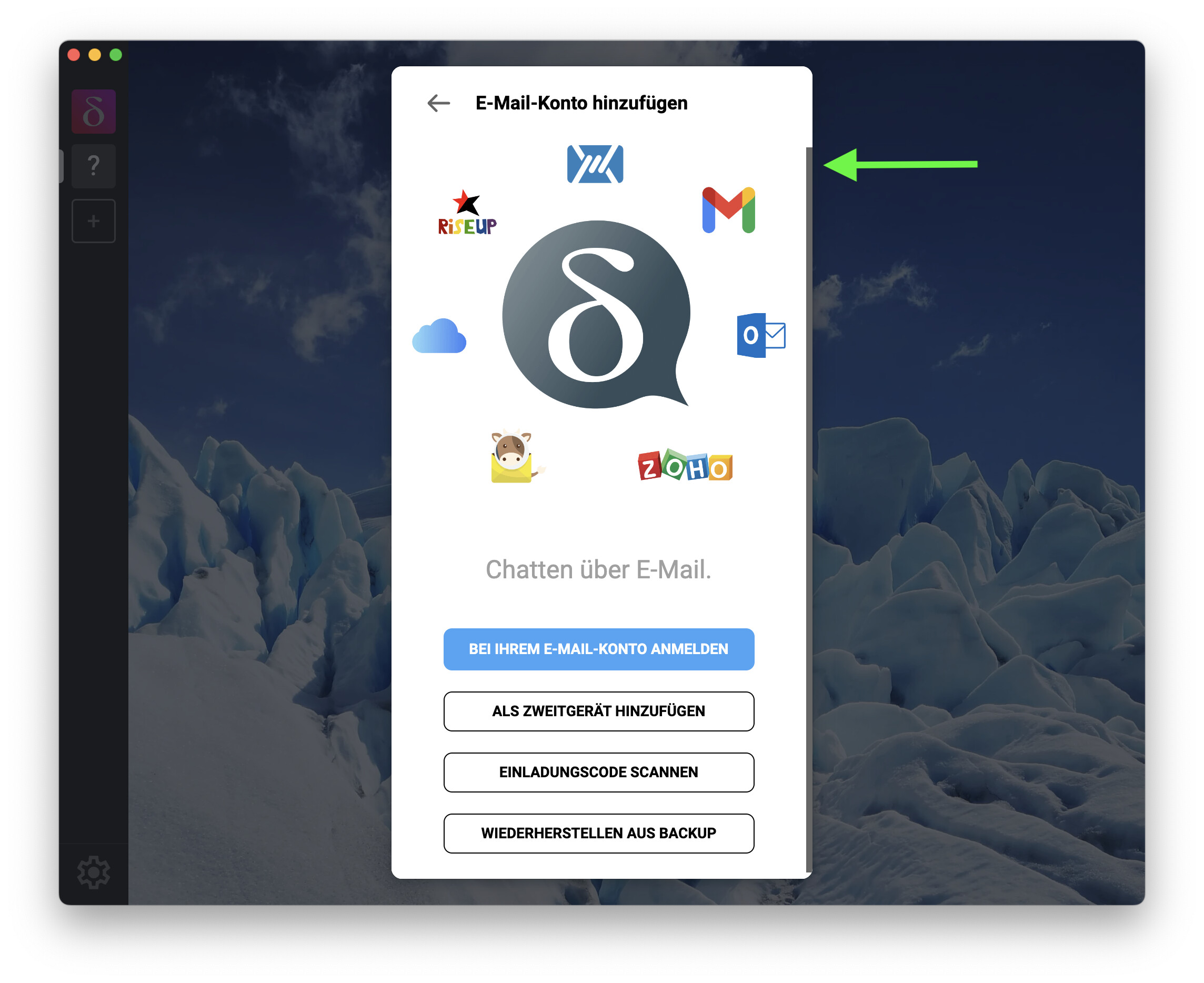
Remove scroll bar from the “New Account” screen
In my opinion, the bar is superfluous. All content fits into the window.
It would also be possible to place another button there in the future without users having to scroll.
Of course, this is only a small detail, but the window would look more tidy.
After all, it’s the first thing a new user sees after starting DC.
Size of the Settings and Contacts window
In the new version, the windows change size as needed.
Of course you can argue about whether a variable or a fixed size is better.
In my opinion a fixed size would look a little better.
If there is only a small amount of content to be displayed, it will appear as if the window has been moved up. This is just a subjective impression.
In contrast, the profiles in the new version are always displayed in the same size window as before, even if there is only little content.