I am bringing this from the github issue to this forum for a broader discussion.
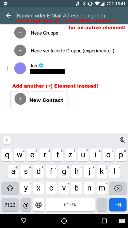
When adding a contact, you need to type in a textfield at top, that is hard to recognize as text field, because it looks like a screen header. The page would profit from a static “Add contact” button like the “add group” buttons, either in addition or as only option.
All three buttons should have more distinctive icons than a +, so you can choose the right one intuitively.
(See images in the github post, new users cannot post multiple image in this forum)
In addition it is confusing how to abort adding a contact, e.g., to add a group instead. Touching the left-arrow goes back to the previous screen, even when it is placed next to the input field. The x does work, even when it is more commonly associated with “close” (possibly going back to the previous screen?). This could all be solved by adding a button “add contact” instead of this indirect flow.
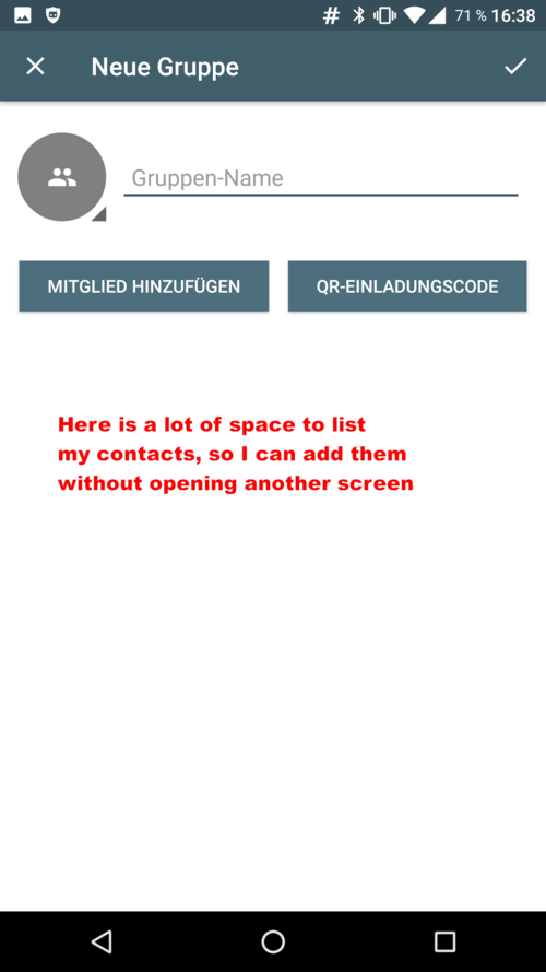
In contrast, when adding a group, the screen looks like this:
(See images in the github post, new users cannot post more than one image in this forum)
Here is a lot of white space, which could be used to list the contacts, that can be added to the group (and possibly a textbox for filtering the list), instead of of opening a second screen.
Finally, the “archive” icon when selecting conversations is not obvious at all. I do not even know what the icon should depict, and especially do not know what function it may have. It is not available in the “…” menu, so I cannot read what label may match the icon, either.
I do not know, if you may already have some of the issues on your roadmap, I just thought when I am trying it again I use the opportunity for some “first impression” feedback before I get used to the way Delta chat handles these functions and do not notice the issues anymore.