I think it would look better if the “Send Message” button was not on the left side but in the middle of the contact window. Of course, this is only my purely subjective opinion.
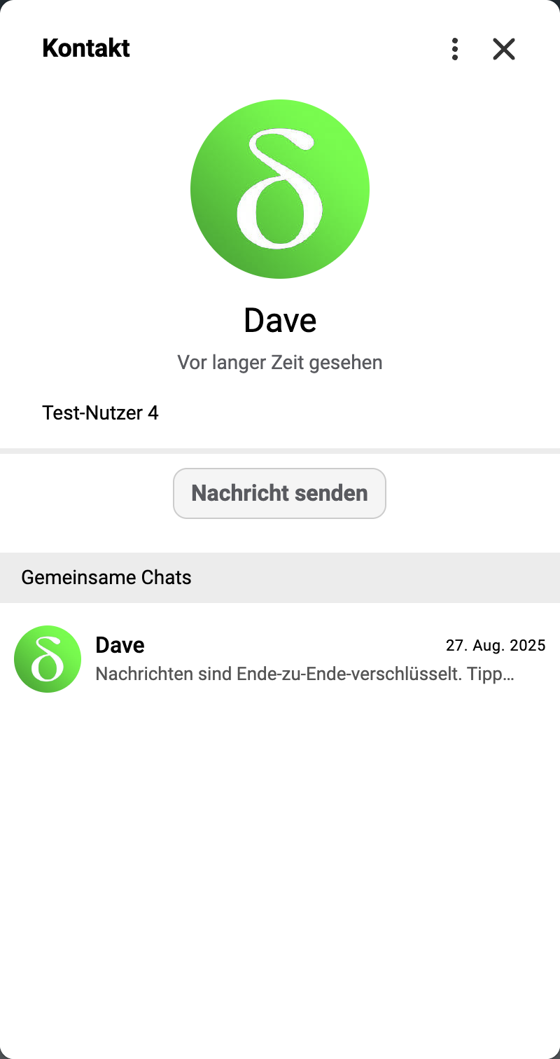
Personally I like neither option.
we need 3 buttons in a single row like WhatsApp:
message
call
video call
with icon, that way the screen will look less ugly/empty