thanks for the suggestion! a second button bar - interesting! however, not sure. it is on purpose to put more rarely used functions one more tap away - and having “icons only” does not necessarily make thing easier for avg user. also, harder to add things. and the example would create additional rows (save and reply privately is missing at least), which does not fit on some phones without scrolling, resulting again in bad ux.
but we will keep the suggestion in mind for the next iteration
for power users: did you know you can enter “select”
True, that could be the case. But on the other hand, the icons are very self-explanatory and similar in most apps. To be honest, the idea wasn’t mine. I saw it in Threema and thought the solution would work for DC as well.
I also think it would be more difficult to add new functions like for example favorites, but the context menus with the current functions would not be larger than they are now.
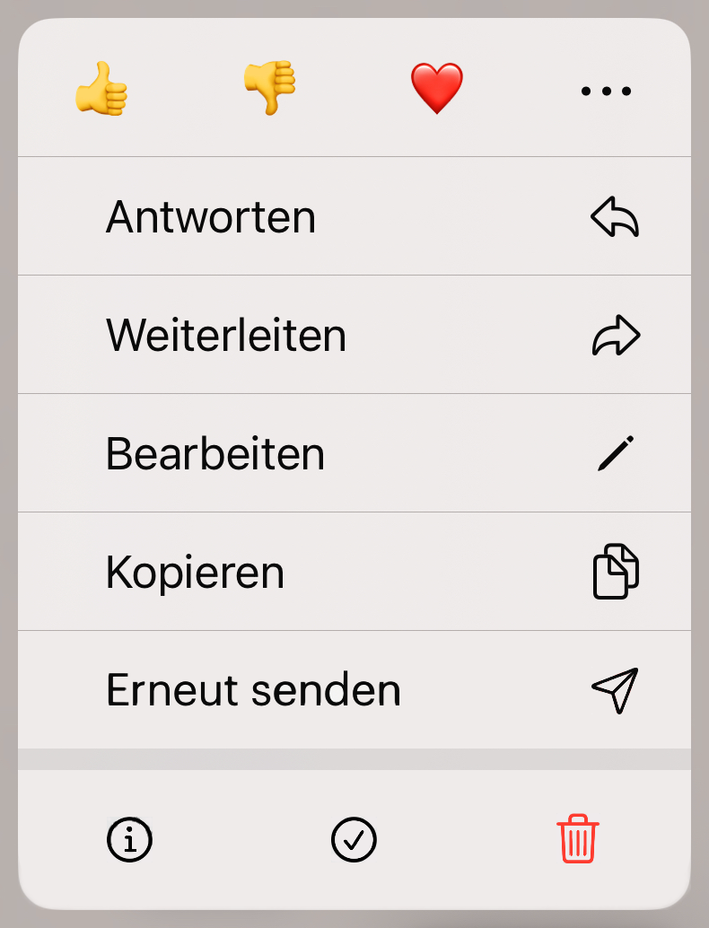
“More Options” appears in the main menu and the submenu, but in the main menu it is a clickable menu item which brings up the submenu, while in the submenu “More Options” is an unclickable menu header, despite similar appearance, so this is inconsistent and potentially confusing, and there is no way to return to the previous menu.
I think that when the submenu is opened, it would be better to put a left arrow next to “More Options” which returns to the previous menu when tapped.
this is not true, at least on recent iOS, a tap in “More Options” in the submenu shrinks it again. in general, we’re just using the iOS standard menu controls here, so it should be pretty expected to the user
The behavior is how I described for Android. Tapping “More Options” in the submenu has no effect, the submenu can’t be shrunk, and the visual appearance of the menu header is almost identical to the menu items. Maybe the design elements of the menu controls don’t translate so well from iOS to Android?