The HTML (in my screenshots, all black-on-white text) is not translated because I assume that people who are interested in tech enough to read through this usually speak English. And we plan to further improve the HTML, anyway, so even if we do want to translate it, probably not yet. (fwiw they would be 7 strings to translate). What do you think?
I would localize all strings, because I know any unlocalized string would “turn off” people who are no techies, and I believe Delta Chat is meant to be for people of every kind.
sure, once that is done, things will be localized, where possible and reasonable (for error messages, this is often not doable as they come eg. from the server – and, also, it is not that wise to translate them as you cannot search them in some search engine) (or you will miss the one information that would have helped you).
however, up to then, it is reasonable to stay in english, as things will probably shifted around and reworded massively
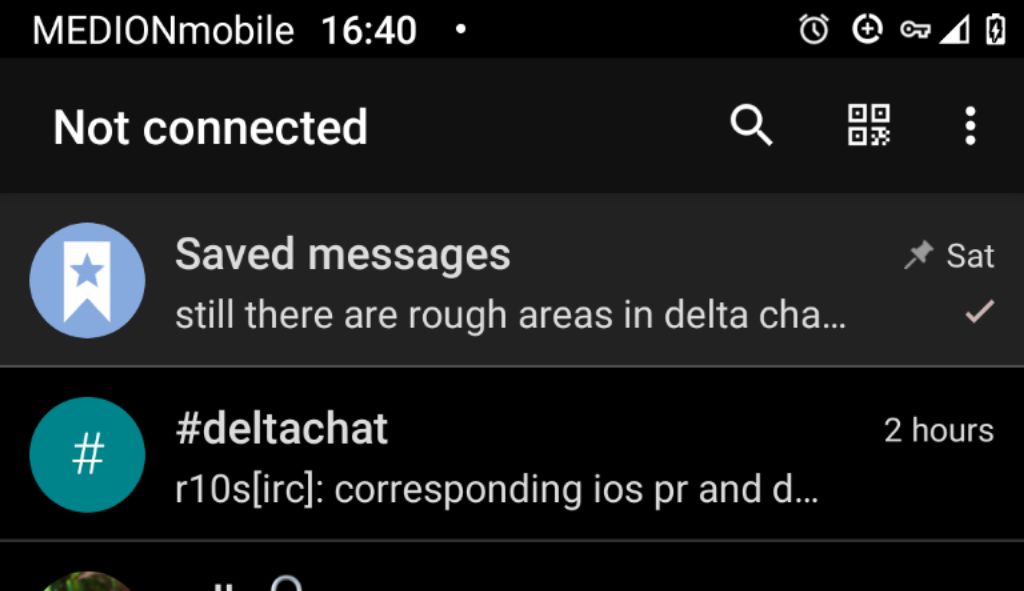
I would like very much, to know when there is a problem, but having a text other than DeltaChat in the title for a long time does not please me very much, I suggest only two states, “Not Connected” for when there is an error and “DeltaChat” for all other cases.
Yes, well, as I understand it, the intention is to put “Not connected” even when the mobile is in airplane mode, I don’t think this is an error, it is simply that there is no network. I think they should put “Not connected” only when, having a network, delta cannot connect.
“Not connected” is a status, not necessary an error.
In airplane mode “Not connected” IMHO should be shown. Because it is the correct state in that situation. It’s not an error.
Some thoughts:
match “reason for not connected”{
“Device signals online” and “first error in connection to mail server” => “Connection error”
To begin with, it would be enough to make the color of the icon in the status bar green if everything is normal and, for example, gray if something went wrong.
Not everyone uses the reliable background connection which, indeed, seems to me to be disabled by default and I think many of those who enable it then disable the display of the permanent notification (at least I do), so I think it’s not really a solution to the problem.