While there is no network, I wouldn’t put any warning sign there because otherwise users would wonder what is wrong. And while there is network, we are not connected and there was no error (i.e. we are currently connecting or the network is flaky) we could put a rotating circle there, just as we do for pending messages.
Idea #3: Replace the title
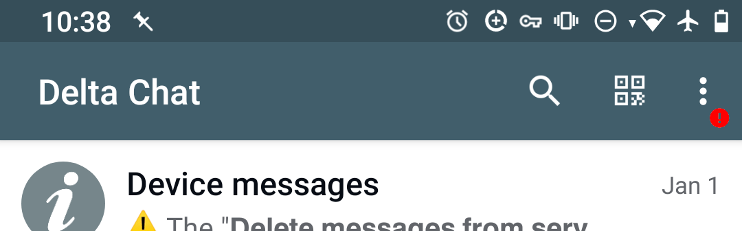
instead of writing “Delta Chat” there, we could also write sth. else. This would be the easiest to implement by far, the problem is: As the text is so big, we can’t write much text there.
i’d say both #1 and #2 are fine, depends a bit how hard that is to implement, #2 might be a bit tricky, but that would be my favorite, also because of it is clearer where to access the “status” if there is no error (see next paragraph).
in general, the idea is to have a “Status” option in the main menu, that shows the errors, if there are some, but is also useful when there are no errors (“connected since”, “number of messages delivered last week”, sth. like that). The idea is that the status page comes from core as a html - this way, we can easily improve and enhance that without always thinking about at least 3 ui-implementations.
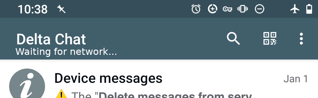
for the subtitle, it is probably better for the beginning not to try to put too many concrete connection information there, sth. as “Waiting for network”, “trying to connect” etc. has issues on its own.
as a first iteration i would just go for a “has connection error” state with the values yes/no.
The 3 images were meant to belong together but of course we can realize images 1 and 2 but modify what happens on error (image 3)
I think 3 states (Connected, Not connected, error) would be nice, so that the user can be sure DC is connected. If we only have 2 states (error/no error) then the user won’t know if we are connected or DC is still trying to build up a connection.
If we make an FFI with two 2 states and then switch to 3 later, this will be another FFI or a breaking change, so I think we should do it from the beginning.
Doing:
if core says "connected": everyting fine, do nothing
else if there is no network: "Waiting for network..."
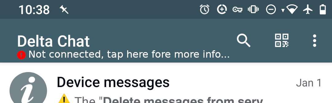
else if core says "error": "! Not connected" (or red exclamation mark, if we go for idea #2)
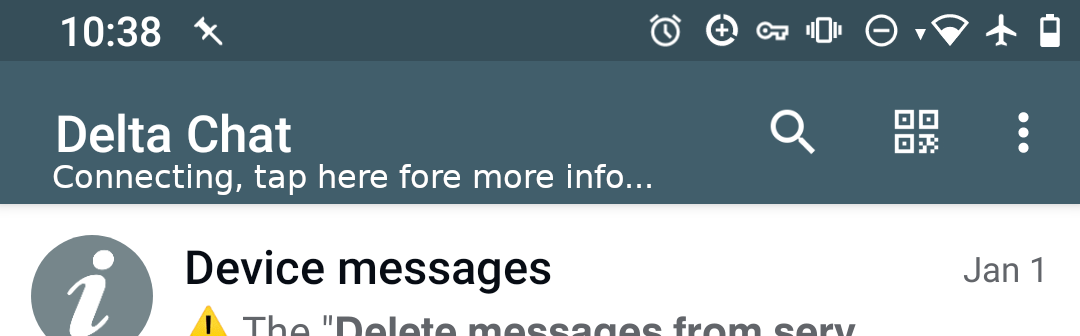
else "Connecting..." (or rotating dotted circle, as we have it for pending msgs, if we go for idea #2)
sounds pretty straightforward and not too much work for me.
BTW we can decide for a way to show the error state (e.g. my idea #1 to #3) independently of how many error states to show: If we decide for Idea #2 and 3-state just put a rotating dotted circle (as for pending messages) instead of "Connecting..."
I also like the idea of a Status, which opens a page displaying your provider, whether it is connected or not etc., some troubleshooting information. And a badge hinting to look there, both on the “three dots” like an and on the menu item, to guide user where to look.
This would be really useful, especially when we have true multi-account support. I would even remove the “Delta Chat” title completely and replace it with avatar and username, and open profile editing page when clicked.
@link2xt that sounds like a really useful UX improvement +1
@Hocuri I also think it would be good to have more states for the status, knowing if the app is actually connected is some old users request: Make connection status more visible
with “issues on its own” i was thinking more about how core can differ between “connection error” and “not connected now, but probably in a few seconds”. this “no network” is known to be tricky, in flaky situations, this may change several times a second.
however, i would probably be find with more states in the ui, depends a bit what the core can provide reliably with reasonable effort. we will see what we can get actually
@r10s and I settled for this solution, mainly because it’s quite easy to implement:
We use Idea #3 Replace the title, just like Telegram. That’s doable in 1 line of code, if we want to do sth. more dedicated later, we easily can.
States are: “Not connected”, “Connecting…” and “Delta Chat” (for “connected”)
While the title is “Connecting…” and “Not connected” the user can tap on the title to get to the status page, coming as html from the core.
In the settings, “App access” is moved to “Advanced”. Under “Advanced” we add a new item “Connectivity” that also opens this html page.
What we did not decide for, and esp. why:
Dedicated “Error” and “No network” states: We can’t reliably distinguish them
A emoji in the title bar when not connected: probably annoying to have an eye-catching there everytime there is no network
An entry in the menu: People probably rather look for this in the settings than in the menu. And in case this very good one day so that you would want to frequently use it, we can still move it into the menu.
Showing a “Getting new messages” status in the status line: It would probably be frustrating to see this state shown from time to time, and sometimes a new message arrives, sometimes not
After my first quick-and-dirty implementation of what I described above, I did some user-testing with my family, these are the results:
Added status emojis (, , , ) to the html page ( for not connected, and so on)
Adapted error messages for SMTP:
“Not started” → “(You did not try to send a message recently)”
“ Connected” → “ Your last message was sent successfully”
because we can only know that sending the last message succeeded, not whether sending one now would succeed, and showing wrong information is veeeeery confusing.
One thing I couldn’t solve yet:
“Not connected” is misleading, because they think that this means that there is no internet connection, but “Not connected” can have other causes, like, a not responding server or a changed-but-not-updated-in-DC password
Possible solutions:
“Not connected” → “Not connected with gmx.de” (or whatever comes after the ‘@’ in configured_addr). The problem: some people have an own domain for their emails, but no own servers. "Not connected with " and might make them think that the problem is that DC tries to connect to the server , while the server is hosted at Strato.com.
We can ask the system whether there currently is network and then show another error message. The problem: Sometimes the system is wrong. Also, I didn’t come up with a good message yet.
And finally, that’s a great opportunity to correctly handle the password-changed-but-not-updated-in-DC case. Maybe in another PR.
into onPrepareOptionsMenu() and then simply set the icon using android:icon= in text_secure_normal.xml (which is the menu, no idea why the file is called “normal”). This way, we have an icon in the menu.
Then, we can just replace the three-dots-icon with a new icon that contains a status indicator using toolbar.setOverflowIcon(ContextCompat.getDrawable(this, R.drawable.whatever));
I’d say, let’s not do this right now, but use what I described above, because I’m basically done with that already. But all of this needs some more tweaking, anyway, e.g. because “Not connected” sounds like you have no internet, not that there could be a problem with your password or the server. And we still have to better handle the password-changed-but-not-updated-in-DC case.
The thing is, what we still need is a short string that says “There might be no network, or there might be another problem when connecting to your mail server”.
But if we don’t find a good solution now, we can also postpone this. Maybe we will end up using for the connectivity, then we don’t even need such a string.
if “Waiting for network…” is also known by other other messengers, that wording is maybe a bit better, indeed.
in general, i think the approach you showed me in a/v is not that bad, just saying “Not connected” or “Waiting for network…”. even if that wording might not catch exactly 100% of cases, it is better as some colors or icons that needs explanation in any case.
also, the “Not connected” is shown inside Delta Chat, so it is not that weird to assume it has sth. to do with Delta Chat and the configured account - and not with general network, power cable, headphones (it is a bit like “Press any button to continue” → user presses “Power” button or searches for a button with the label “any”
and if you tap on the string, you get detailed information.
My reason for not choosing “Waiting for network…” but “Not connected” was that “Waiting for network…” definitely says that sth. is be wrong with the network, not the server or password. Which might not be true. But of course, should we go the way of distinguishing the no-network and the error-connecting-to-server cases, “Waiting for network…” will be the best string for the no-network case.
I see, the issue is that currently core api can’t differentiate if we are not connected because device is offline, or not connected because an error etc. then IMHO it is fine for now to use “not connected” I think it is clear is the app what is not connected, it is clear for the user if mobile data/wifi is connected and other apps work etc
Yes, it is (was) still an issue for proper job handling in core, that ffi interface doesn’t hand over the device connection status to core.
Therefore I extended ffi interface in my own fork with this information. Thus I introduced a new “connection status” flag which is feed by device’s connect status information and connection behaviour results from mail server(s).

 emoji in the title bar when not connected: probably annoying to have an eye-catching
  ,
,  ,
,  ) to the html page (