Some users complain that it isn’t obvious if Delta Chat is connected or not, Delta Chat shows toasts with some errors or “network unavailable” but it isn’t obvious for the users if after that they are connected.
In the case of Cuban network, disconnections happens a lot, since the network is slow and unstable.
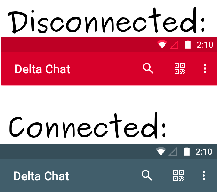
So I suggest a more attractive and visual way for the user to know in any time if they are connected or not. I would like a bit of brain storming here, one basic idea could be to use the Delta Chat top bar colour to indicate the connection state, for example some red for disconnected and the default colour if everything is fine. If you come with a better way please share!
example of a basic solution(just to trigger your imagination):
I agree with this but that “single place” should be visible everywhere in the app…
another idea:
maybe not the whole bar but some kind of thin undefined progressbar close to the top bar, something like the thin progress bar of github pages(when loading), as example, but undefined(no progress)
Maybe easiest, and just fine, simply let the current “network unavailable” overlay notification stay (not fading away again) until the connection is reestablished.
This also have inconveniences, graying out the whole screen may be unwanted as people may want to read offline the messages, and the background is not visible everywhere and both have issues with the dark mode or with custom backgrounds, that would be much more complex than using the top bar.
There could be another errors, people will find Delta Chat buggy if Delta Chat says “Network unavailable” and they can check that others apps have connection and the network isn’t unavailable at all. And also the notification if will be a toast, as it currently is, will be a bit obtrusive.
Maybe It’s that I don’t care at all, but, why don’t you just put something like “(offline)” next to Delta Chat in the title bar? I mean, it’s the simplest way.
ok, but then you could use an emoji or something like that. I mean, in the future we should be able to play with the colors of DC, so it’s safer to make this kind of notification with a picture/emoji/whatever
 :
: