Andreas
December 10, 2021, 6:16pm
21
I think that an improvement in the account server login screen should be improved, because it often creates confusion and many do not immediately understand that this is not a registration to the “Delta Chat service” but it is about entering your credentials to access the your e-mail.
Andreas
December 10, 2021, 7:37pm
22
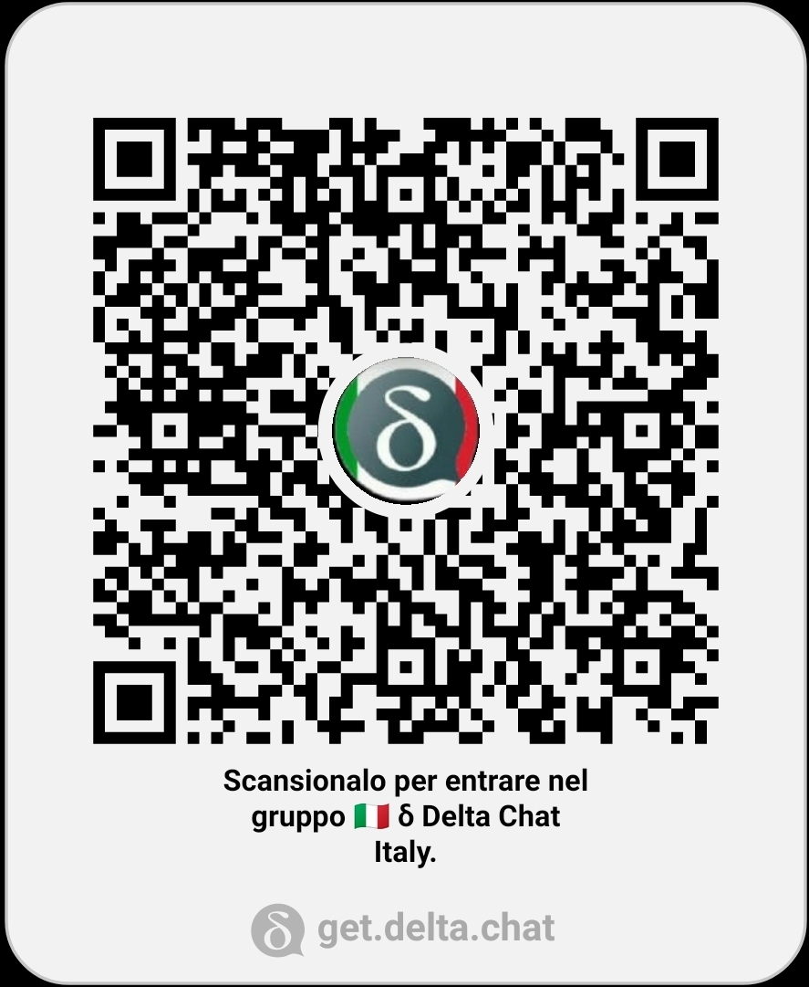
You seem Italian or speak Italian, if you want you can access the Italian group by scanning this QRCode or import this image:
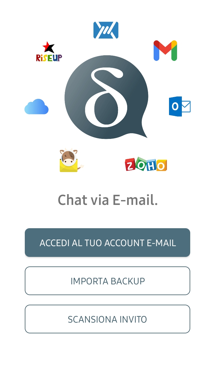
Let’s talk about neutrality…
I’m testing today’s nightly and I find this.
I don’t agree with this choice.
2 Likes
But thanks for the new login version!
2 Likes
There is some discussion here:
deltachat:master ← deltachat:new-welcome-image
opened 12:05PM - 30 Apr 22 UTC
this is the outcome of recent design discussions - so, this pr should not start … further design discussions but check technical aspects of the implementation :)
before/after (the bad-looking button border and pixelated image is an emulator thingie, this is correct on real devices):
<img width="337" alt="Screen Shot 2022-04-25 at 22 00 47" src="https://user-images.githubusercontent.com/9800740/166104555-b01cbab3-4d2d-4614-9a7a-a2238d61fe88.png"> <img width=337 src=https://user-images.githubusercontent.com/9800740/166104533-c5e9d500-9d07-41cc-8a81-e4bba79fdd93.png>
i tried to make it nice for several screen sizes, however, it looks best on "typical, bit larger" smartphones used nowadays. smaller phones are fine as well, but spacing is not great there (as there is fewer space :)
it should already be fine in dark and light mode.
i think, if we merge that in, we will get more feedback on the first testing round wrt devices and layout.
successor of https://github.com/deltachat/deltachat-android/pull/2280
1 Like