Accidental chat deletion can happen because the chat deletion dialog looks to similar to the message deletion dialog.
previous conversation:
Accidental chat deletion can happen because the chat deletion dialog looks to similar to the message deletion dialog.
previous conversation:
First mitigation action really should be the main issue of this feature request: “Make deleting chats look more dangerous”.
And make it clearly different from deleting other single items.
this would not have helped your friend on the issue linked above, or? (thinking things can be undone)
deleting a single message can be even more harmful than deleting a whole chat - that depends. and if we make the one dialog look very dangerous - why not the other? can’t the next issue be then “i thought this is not too dangerous as the dialog did not look dangerous?”.
also, none of the style-guides i know about recommend this “one delete should look more dangerous than the other” - text, button label, maybe icon, of course, should be specific (cmp. eg ios, win)
so, tbh, i would not try to tweak the layout between different “delete” dialogs too much. this is much effort and the outcome is not clear. not even that it is positive.
instead, as a first iteration, we could say clearly that the action cannot be undone. in case of the chat, we can also say how many messages will be deleted, similar to the autodelelete-confirmation. i would start with such things.
There are plenty of examples of highlighting some dialogs, for example when an app wants admin rights on windows 10 it spawns a dialog with a backdrop that also hides everything else. And it requires even the admin password if its setup like that.
confirm dialogs sometimes show icons (![]() or
or ![]() )
)
https://docs.microsoft.com/en-us/windows/win32/uxguide/images/win-dialog-box-image24.png
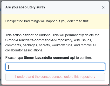
Some super destructive options require you to type in the name of the object you want to delete (like deleting a repository on github.
The general concept of this is to do something different to catch the users attention, another option could be that you need to wait 4 seconds before you can press ok.
One question here is how much we want to break the flow of the user, if we make them think too much they’ll be annoyed (or potentially even get into danger in the case of activists), if we wouldn’t show a confirm dialog at all they would make more accidental mistakes.
![]()
Another small tweak idea: change the color of destructive options to red.
But on the other hand I don’t think that this is so important because most people would not make that user error anyway, at-least on android and desktop its hard to do that mistake.
I see more the scenario of being angry at a person and deleting the mutual chat and after making up they want it back. (I know some people that have blocked and deleted chats out of anger).
What I’m trying to say here is that in my eyes deleting a chat, when you want to delete a message, by accident is unlikely to happen and there are more important problems/bugs/issues/features we need to address.
WhatsApp’s clearing of the chat history is final too (if there is an undo for that I didn’t found it).
my point was more about deleting “normal objects” that are used/created/deleted “everyday”. for sure, there are special dialog for formatting disks, account deletion and such things. we also have them when the user enables auto-deletion. but these kind of things should be used sparingly to have an effect.
yip, i totally agree.
What about an “undo” button? “undo” is widely considered a better UX than a confirmation dialog: https://ux.stackexchange.com/questions/71960/deletion-confirm-or-undo-which-is-the-better-option-and-why
We could add a 1 minute delay until we actually delete the chat, and after 1 minute the undo button vanishes. Is this technically possible?
technically, of course, undo would be possible, however, it is not implemented and would be quite some effort - so out of scope for a “quick fix”.
also, as @Simon pointed out at Feature request: import old messages (assuming you have the keys), undo also has its ux issues and may fail expectations of eg. activists. of course, that can be mitigated, maybe by a timeout, a special button, however, this again increases effort and complexity of what users have to understand - and some risk will probably remain by the nature of undo.
for both reasons, i would not target undo for now.
Hey guys, I think you’re underestimating the situation.
Situation (unexperienced user):
you want to delete a picture where send process is pending, but not possible for a while (bad network). You open chat’s menue to delete that message.
If you are into a chat, the menu for possible actions looks like this:
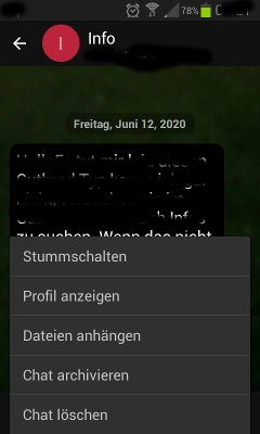
all actions have the same look! Even the dangerous “Delete Chat”
If you push “Delete Chat” you have the following dialog:
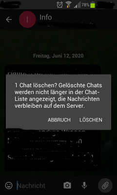
=> You see more the delete button than the hint of deleting a chat!
Now keep in mind that deleting the chat will purge around 2000 messages and uncountable amount of pictures!
If I realize that, for me it’s clear now that this action absolutely should be signaled more clear for the user than deleting one message or all the other small and undo able actions !!!
At least:
Maybe this explanation makes the situation more clear?
IMHO A first mitigation of the issue here should warn the user to do a dangerous action, rather that to introduce an undo function.
As I recall the situation this accident would not have happened if the user had been warned appropriately.
Maybe we should not allow to delete a chat unless it has been archived before.
as pointed out before - as a first step, we should say clearly how many messages will be deleted and that the action cannot be undone.
once this is implemented, we can iterate over, if needed.
IMHO this is a good start for now 