The “New Chat” button is located at the bottom next to the “QR Code” and “Chat” buttons.
Actual behavior
The “New Chat” button is in the top right corner.
Explanation
I think this change would have a few advantages:
It would be easier to create a new chat with just one hand, even on large displays.
The “Chats” button with the DC logo would be back in the middle.
In my opinion this would look better and more symmetrical.
Speaking of symmetry. Similar functions would be closer together.
On the left side of the “Chats” button one could start new chats using a QR code and on the right, traditionally, by entering an email address.
DC-iOS would become more similar to DC-Desktop and DC-Android, as the “New Chat” button is already at the bottom in these versions.
In DC-iOS one can edit the chat list by holding down a finger on a chat.
This is very practical, but not immediately obvious to new users.
Moving the button frees up space at the top right.
One could add a menu there to edit the chat list.
However, experienced users would probably prefer the other method.
But future features could also be added to the menu.
For example, creating chat folders like in Telegram.
In the iOS versions of all messengers I know of, the “New Chat” function is located at the top right.
This is essentially a standard. But why shouldn’t one do it better?
Maybe a floating action button like in desktop (though I haven’t really seen that on iOS yet).
The thing at the bottom is a tab bar to switch between tab views, so we can not really put an action there.
I have an iPhone SE, there I don’t have this problem. Anyways I think we can talk about adding a floating action button, but putting an action inside of the tab bar is not possible.
But couldn’t there be a tab view that contains the contact list and the buttons for new contacts, groups and broadcast lists?
Maybe I’m misunderstanding it, but the other tab views also contain functions, don’t they?
Use a tab bar to support navigation, not to provide actions. A tab bar lets people navigate among different areas of an app, like the Alarm, Stopwatch, and Timer tabs in the Clock app. If you need to provide controls that act on elements in the current view, use a toolbar instead.
~ https://developer.apple.com/design/human-interface-guidelines/tab-bars
Thanks for the information.
Ok, it’s probably more a matter of interpretation and not a technical problem.
Theoretically, one could argue that the contact list also represents a separate area that can be accessed via tab. By contact list I mean the “New Chat” screen.
The “QR-Code” button acts on elements in the current view by adding a new chat.
It performs the same function as the “New Chat” button, but in a different way.
This is one reason why I suggested moving the “New Chat” button to the bottom.
The search function in Apple’s Photo app also interacts with the photos in a certain way (filter). However, it is not in a toolbar. This is probably because Apple sees the search screen as album.
Again a matter of interpretation.
The Mastodon client “Metatext” is the only iOS app I know with such a button.
while this may be the expected behavior when coming from android, it is
is not the expected behavior on iOS - compare whatsapp, signal, telegram, imessage etc - most have the “new” functionality in the upper right corner. note, that also other messengers differ between the systems.
while feature-wise and also UX-wise, we try to be consistent between android/ios/desktop, when it comes to UI, we usually vote for consistency with the system
btw, the Mastodon app (i am using it as well, nice app otherwise) breaks UI guidelines and expectations with the “new post” button (it is misplaced, as well as the “settings” button; they should be swapped roughly to match guidelines)
so, all in all we try to follow the iOS user guidelines - which are sometimes in conflict with the user experience on other OS. but all in all it is widely regarded as a win to have apps that are consistent with the system and also with comparable apps.
I understand that and there are good reasons for it.
So it’s a question of design philosophy.
I tend to pragmatically combine different approaches if I find them useful.
That’s why I made this proposal.
I understand the arguments against the proposal and of course accept them.
Nevertheless, I would like to add one more point to this discussion.
Even Apple doesn’t always stick to its own recommendations.
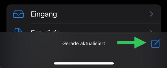
In iMessage, the new message button is located in the top right,
but in iOS Mail, it’s in the bottom right.
If I remember correctly, the button used to be there at the top right too.
But then Apple probably thought it made more sense below.
I hadn’t thought of that at first because I don’t use the app too often.