Hello ![]() ,
,
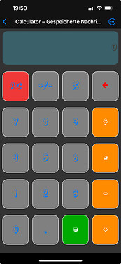
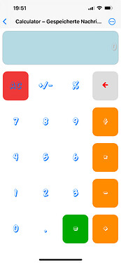
I noticed that the new calculator app in DC-iOS (dark mode) has a very poor contrast between the keys and the numbers as well as in the “display”.
It is much better in light mode. But the “display” should also show more contrast.
I actually wanted to write this on GitHub, but I couldn’t find the app there.
I’m not the creator of the app but I know him, so I will tell him the issue.
2 Likes

