Hi !!
The desktop app is very cool, but I feel like the UI is very “flat” (idk, this is the word that comes to my mind), and could be made much more palpable with some very small CSS enhancement.
I open this thread to discuss of these ideas, which are all probably easy to implement, so the most important is to discuss of these first.
Also there may be a thread like this one already, but I couldn’t find it
1) Drop shadows
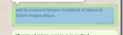
I would love to see some drop shadows to anchor better the messages.
See the comparison using this CSS filter :
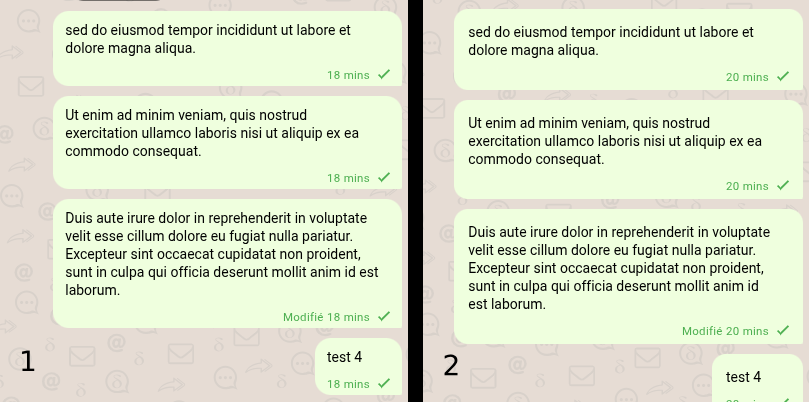
Maybe I am not explaining myself very clearly I would basically increase the padding to something like :
(I didn’t look into the code in depth, so I may be handling the padding wrong)
.message .msg-container {
    border-radius: 14px;
    /* the rest should be bigger than border-radius ! */
    --msg-container-padding-horizontal: 14px;
    --msg-container-padding-top: 14px;
    padding-bottom: 12px;
}
I already find the existing padding excessive and would preferred if more content fit on the screen with less scrolling. Especially as most desktops have screens of landscape orientation, so the ratio of scrolling is usually more than on a portrait mode phone.
I agree this is a problem, still see from time to time that users want to share group QR code but share their 1:1 QR code instead by clicking this button while being in a group.
Thank you for the insight. Out of my own curiosity, I would be interested in more details about this claim. We are already running a whole electron app, would it really make a big difference ?
But about this specific problem, you could achieve a similar result with a border actually
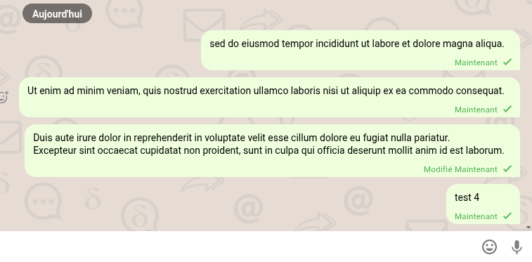
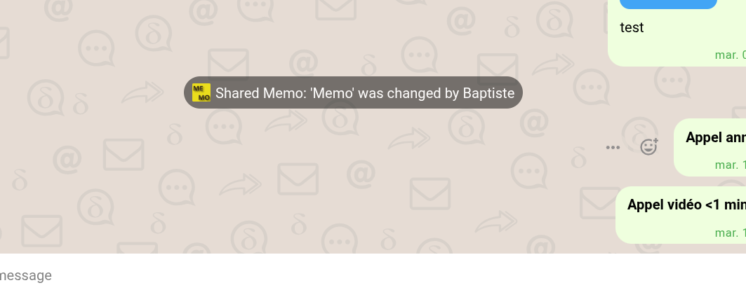
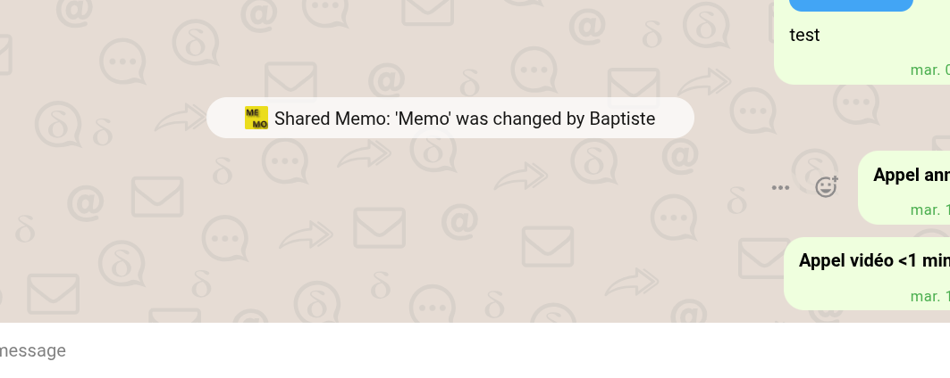
I find the info bubbles pretty annoying and they unnecessarily capture too much of my attention because of their black color. At least for the light mode, I would prefer a design like this (I also added some padding on the sides)
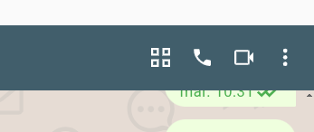
This one is less about CSS, but I think we should have this icon in the top bar. Currently there is only the phone icon, which opens a submenu where you have to choose between audio and video.
Drop shadows may seem fine for tiny examples and small offsets, however, applying it to every message in the scrollable timeline would trigger the worst case behavior for it. Electron apps are already jerky as is, let alone if we had slowed it down even further.
but it would be worse the other way round - inviting someone to a group where you want to do a personal invite only.
it is not clear what to do about that, changing position or so, and what would be an improvement.
for the other things of this proposal: thanks a lot for the ideas @baptiste, we are reading that. however, most things are on purpose, padding, info messages, messages. for various reasons, eg. the list of bubbles which can be regarded as the “document” and they’re usually more flat in contrast to other elements. there are consistency needs with other clients.
sure, some things are also opinionated and a matter of taste. one can always do things differently
however, what’s somehow agreed on, without a due date: at some point we will rework the dark modes, they’re not that streamlined and consistent. that’d be the point to think over refinements
That feature is not supported though, so expect that your themes may break on updates, especially if you go beyond just editing colors with the CSS vars. But otherwise it can be a nice option to customize the design without forking Delta Chat and without having to figure out how to distribute/release your fork across stores.
(example of a custom theme I did for myself Custom theme for deltachat (draft) · GitHub, though it is only a rough prototype to show the point, contrast is bad in some places)
Some may scoff at this, but tiny CSS changes can go a long way. It can mean the difference between a user thinking it looks unreliable to a user thinking it looks reliable.
I’m also skeptical of this claim. The app already has a huge amount of CSS.
A bit out of topic, but that line caught my attention :
I don’t fully understand how is this project managed / organised.
Is there a UI/UX group ? Is this support forum only about giving feedback ? Maybe I am on the wrong chat, or I should be doing a github issue.
Is there a team of contributors deciding what should / should not be added ?
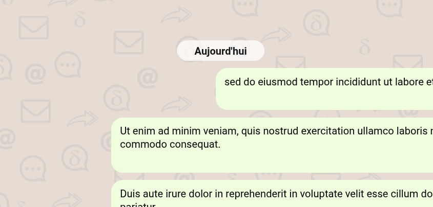
icons too big, some are almost the size of a message, or Today bubble
too much contrast between icons and the background
Because of this, too much of my attention is caught by the background, which should serve more as texture than an image IMO
It would be fun to redesign this background svg, which is 7 years old according to the commit history, from a commit titled playin’ around with theming
Source for background is at interface/background at main · deltachat/interface · GitHub . I personally think improvements there are always appreciated, given that the current background was also a community contribution. (though the team has to agree that your improvement is actually an improvement)
I think it makes sense to have smaller scoped on-point PRs instead of a big one, if you want to increase the chance of getting them merged (faster).
To convey your complete vision for all your improvements I personally would recommend a custom theme that people can just try without rebuilding DC in a local dev env. (makes sense anyway to persist your changes across sessions unless you have a dev env anyway)
