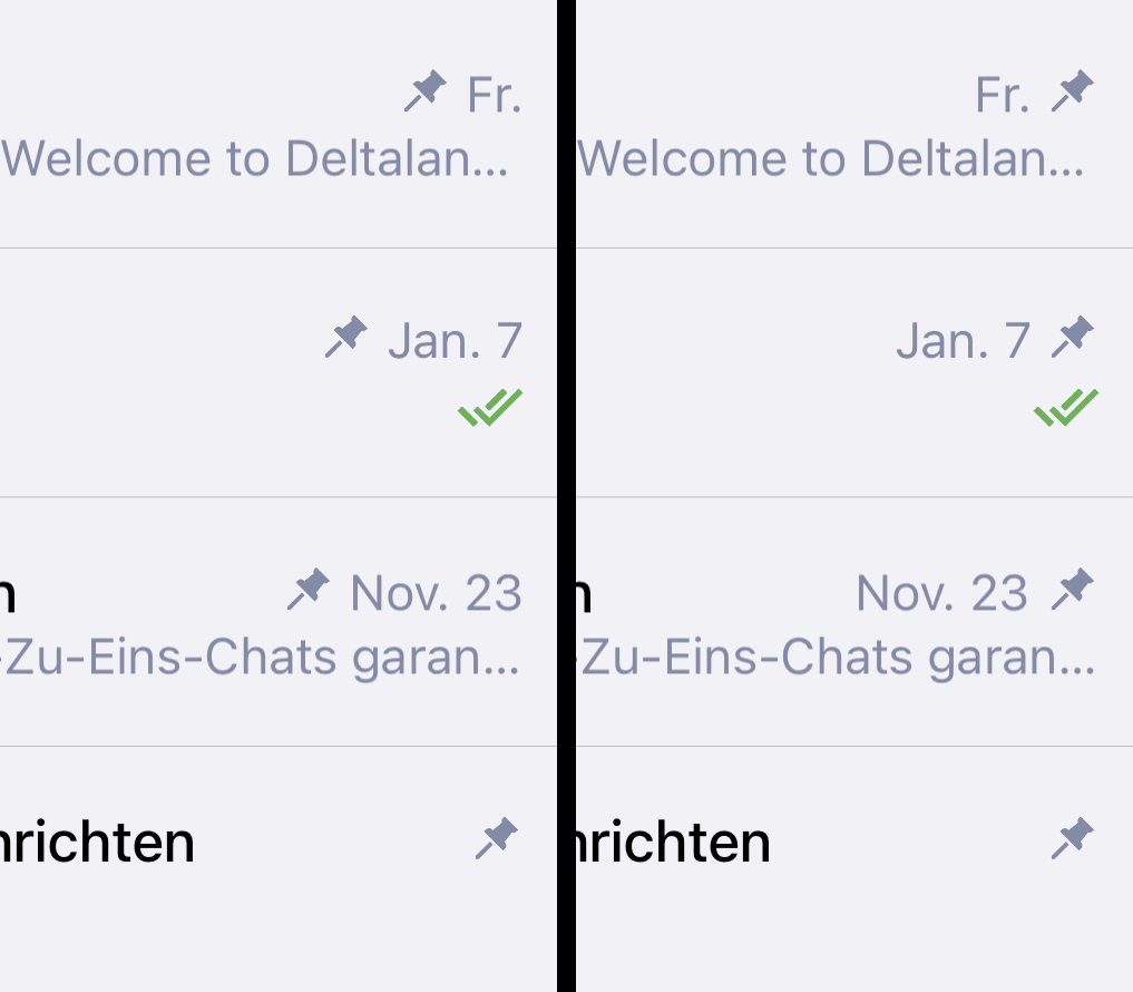
1.) Swapping the position of the pin and date in pinned chats:
Depending on the length of the date, the position of the pin changes.
If the positions of both were swapped, the chat list would appear tidier, especially with multiple pinned chats, as the pins would always remain in the same place.
In other messengers like WhatsApp, Telegram and Threema, the pin position is also fixed.
DC-Android and DC-Desktop have the same tab order except for the fact that DC-Android images and videos are grouped in the Gallery tab.
I think this order is more suitable than the one used in DC-iOS because in most cases users are looking for images and videos and rarely for files. Therefore, they always have to swipe through the tabs in the media library to get to the pictures/videos.
In my opinion it would make sense to adopt the DC-Android tab order for DC-iOS.
3.) Slightly larger profile pictures in the DC-iOS chat list:
The profile pictures in the DC-iOS chat list have a diameter of 162 pixels.
That’s slightly less than the 168 pixels in WhatsApp, Signal and Threema.
Telegram even uses 180 pixels.
In my opinion, the quality of the profile pictures in the DC-iOS chat list would be slightly improved if the diameter were increased to 168 pixels.
That doesn’t sound like much, but it would still be around 7.5% more resolution.
If photos are used as profile images, they are often less recognizable than those with more schematic images due to the high level of compression.
So photos in particular would benefit from the additional pixels.
the pin-date order indeed could be a very easy improvement, same for slightly larger avatars.
for the tab-order: this is on purpose so that two taps are needed to show maybe compromising pictures in the “All Media” tab (the result there may be quite surprising )
(the per-chat-gallery then uses the same ordering for inner-consistency; small drawback is the a little inconsistency with desktop/android, however, that seems to be a good tradeoff as the taps are anyways different)
the date should be the local ones, so the concrete formatting depends on your language and/or your settings; the YYYY-MM-DD iso-standard is afaik not that widely used (at least not here in germany)
On Android the date is consistently local but on Desktop I see “Jan. 9” and “23. Dez. 2023” which is not consistent e.g. in Germany. But it is not so important.
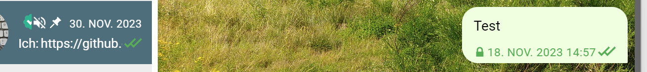
The question is also if this pin sign is really needed. Especially on desktop the space is really small if not full window view is used (and in case of long date). There is already another background colour for pinned chats used. For me we could additionally add “Pinned” (Angeheftet) and “Chats” as headline of the related area as it is done on Android (update: Sorry I mean Signal messenger).
The guaranteed E2E encryption icon could also be integrated into the avatar like the “current online” sign.
By the way there is additionally the mute sign possible which takes additional space.
And by the way on Desktop this mute sign is default for the Saved Messages (Gespeicherte Nachrichten) and I can unmute it. On Android there is no mute sign for Saved Messages and I cannot unmute it which I would prefer also for the Desktop version.
Of course that would also be a possibility.
Since I like clear icons, this solution would be too “abstract” for me.
Icons may also have advantages for users with visual impairments.
In addition, the pin is in the top row and without it, no more of the chat content would be visible than before.
Which version of DC-Android are you using?
In the current versions this is displayed exactly as in DC-iOS.
Signal does it like this. In my opinion, this approach uses an unnecessary amount of space in the chat list.
I’m afraid this would make the profile picture look “cluttered”.
Right, maybe it would also make sense to place the icon in front of the date?
Another option would be in front of the checkmarks, directly under the pin.
Then the green checkmarks would be shifted compared to those in the other chats, but this would make the muted chat stand out more from the others.
The icon should not be placed on the left side of the check mark because it would then be in a different position depending on whether a message was sent or received. Unless the position of the mute icon would be retained even if no green ticks are displayed.
I think the second option is better because all mute icons would always be in the same position. This would mean that less of the message content would be visible, but on the other hand the chat is muted because the user doesn’t want to read it for a while.
The space problem is mainly in Desktop version because on Android the list and the chat part is not visible at the same time. Nevertheless Delta Chat is an excellent messenger and I want so see my comments just as hints.
right, we should change the value of key timestamp_format_m_desktop on transifex in German to D MMM currently it is MMM D, which I agree is inconsistent.
question is where, right. bottom corner is already taken my recently seen, other corners might look weird?
No, no idea what you are talking about, I can not reproduce it. you can mute it on desktop, but it is not muted by default.
We can talk about excluding it from being able to be muted though, if the other platforms do that (and unmute it in core).
The solution would be more responsive design and the feature that the user can resize the chatlist inside of delta chat desktop. And when the window is too small it should only either show the chatlist or the chat, like on mobile with a back button in the nav bar. (this would also help the folks running dc desktop on linux phones like postmarketOS or mobian)
This is problem we won’t solve by just removing the icons, it needs a more fundamental solution.
For me a good solution on Desktop would be - as long as no other solution was found - to keep (or add) the pin icon and the E2E encryption icon on the chat window header, only, and just the mute icon on the name list part as it is currently.
The pinned part could also be closed with a separation line at the bottom.
Very last comment to this topic:
In the name list the date for the previous years could be shortend to “Nov. 2023” because exact date is still visible in the chat itself.