Over time I came up with a few ideas for small design tweaks to make DC-Desktop look better:
-
Improve the contrast between the settings window and the background in darkmode.
-
Show full headline in account switcher.
-
Don’t show scrollbar in add account screen.
1.)
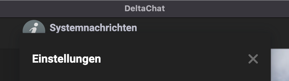
The upper part of the settings window hardly stands out from the background.
I think DC’s appearance would benefit from higher contrast.
2.)
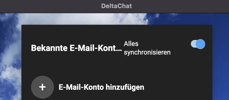
In the German version, the headline is not fully displayed.
Maybe you could move “Alles synchronisieren” a bit to the right.Then there would be enough space.
It would also be possible to write only “E-Mail-Konten”.
The accounts are known anyway.
3.)
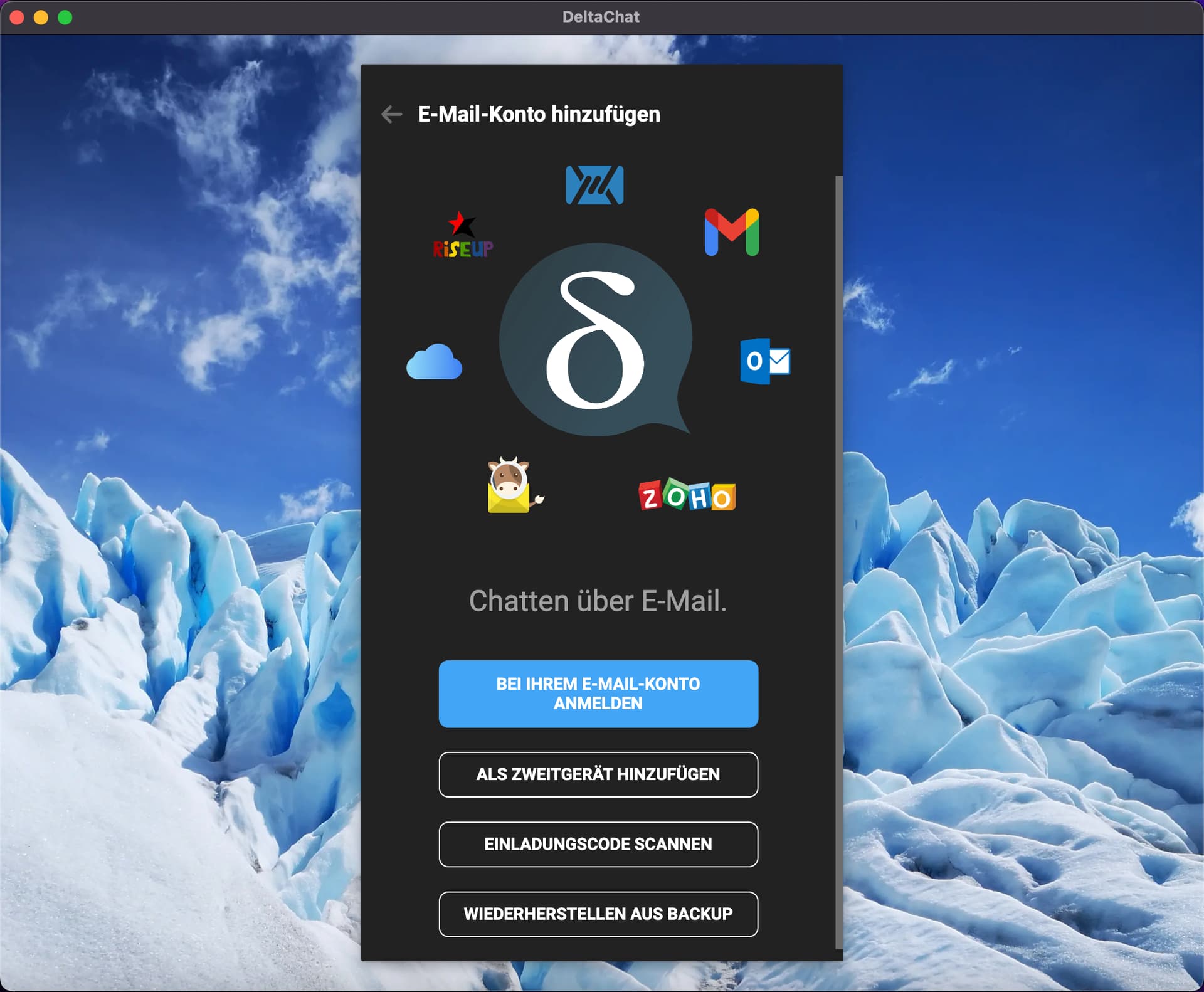
All information could fit completely in the window without a scroll bar.
I think that would make things look a little tidier.
After all, the screen is the first thing a user sees after installing DC.