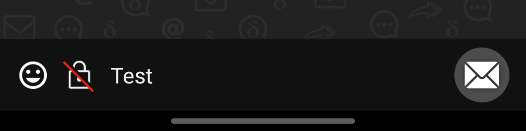
Actual behavior
Gray envelope avatars symbolize unencrypted chats. Furthermore, the email address in the chat title bar and small envelope icons in the message bubbles indicate a lack of encryption.
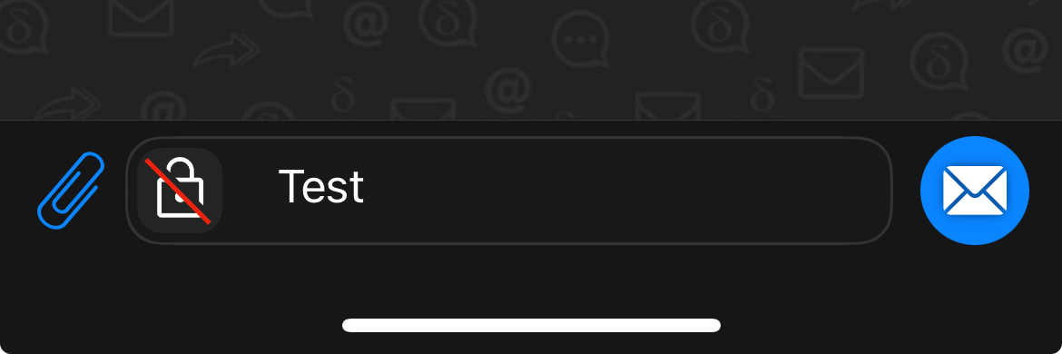
Expected behavior
An icon with a crossed-out padlock on the left side of the input field, like in Firefox, and a send button with an envelope instead of a paper airplane icon indicate that messages will be unencrypted.
Explanation
Since version 2, there are no longer green checkmark badges to indicate guaranteed encrypted chats. Therefore, the gray envelope avatars were introduced.
In my opinion, the resulting lack of personalized avatars is a downgrade, both visually and because it increases the risk of confusing chats.
The tweaks suggested above would address these issues. Since every user has to look at the input field and the send button, it would be impossible to accidentally send an unencrypted message. This would make the gray envelope avatars unnecessary, which would improve the visual appearance of the chats and reduce the risk of confusion. The small envelope icons in the message bubbles would also become superfluous. In addition, an unencrypted chat would still be easily identifiable by the email address in the chat title bar.
I think that it is not necessary to mark a chat as unencrypted in the chat list, since most users use chatmail accounts anyway, and DC’s UI guides them to create one. Setting up a regular email account is rather hidden and intended for more advanced users.
In most cases, regular email accounts are probably used to communicate with non-DC users. Therefore, most chats in the list would be unencrypted anyway.
If there is both an encrypted and an unencrypted chat with the same contact, almost everyone will likely prefer the encrypted one and archive the other.
Of course, users could still accidentally open an unencrypted chat, but they would notice it immediately.
Example Images
DC-Android:
DC-iOS:
DC-Desktop:
