Hello ,
while using the xstore, I came up with two ideas on how to improve the UI a bit.
I would like to put these up for discussion here.
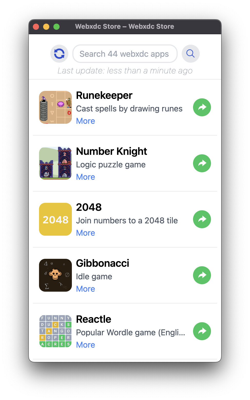
Fortunately, the number of apps in the store is continually increasing.
But this also means that one have to scroll more to update the app list.
That’s why I think it would be better to move the update function to the top left.
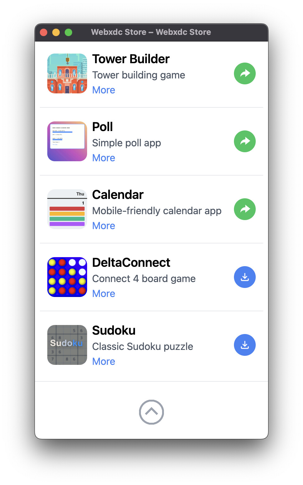
At the bottom of the app list one could place a button to jump back to the top.
Of course, it would also be possible to place the search and update functions at the bottom.
This would be an advantage for users with large displays or those with disabilities because they would be able to use the store better with one hand.
But this arrangement would probably look strange in DC-Desktop.
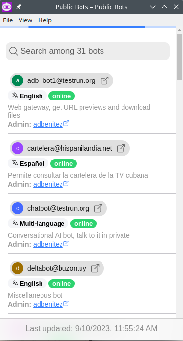
hi, I know that feel, I also struggle going to the end to force update, in general it should update itself tho, you don’t need to manually trigger it in most cases, something that could help is to do like I do in my “public bots” app:
as you can see, there is a top progress bar that indicates the app is refreshing its content / updating
and the bottom footer is always visible at the bottom (sticky, like that title bars that keep at the top when you scroll down)
that way user has more visual feedback, in the case of the app store, just making the footer always visible would be enough
to not lose the habit, as I am know as the master of the workarounds:
there is a trick currently I use to go to the bottom quickly, just input some weird string in the search field, like “zzz” then there will be zero search results and the footer will be visible! hope this life-hack is useful for you in the meantime
it works for me fine in android and desktop, also in iOS some user also told me about that screen but then after some minutes it worked, it might be a “network” issue ex. the bot replies not arriving on time or arriving before the app etc
also notice that this thread has nothing to do with the public bots