Current State
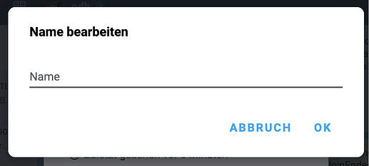
A dialog with an input field, leaving it blank reverts to the name set by the contact/removes the alias. its blank when the user opens it for the first time which is confusing when you don’t know about the alias feature (empty means no alias, it uses name set by the contact).
some previous discussion showing the problem of it being hard to understand: Add fallback to displayName by nicodh · Pull Request #4083 · deltachat/deltachat-desktop · GitHub
This is how it looks on desktop:
Solution ideas
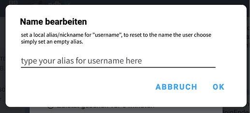
A: Describe and adjust placeholder
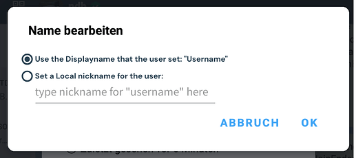
B: Explicit switch/radio button UI
This removes the empty placeholder confusion by adding a button for it, this can also be done fully in ui, if no placeholder is set it selects the first option, if some is set it selects the second option.
Your ideas?
For now these solution ideas are drafts, so wording is not final and needs to be changed. Also if you have other ideas of solving this UX problem, please share them.


