While using DC-iOS, I noticed a few small things that could perhaps be improved. These are mainly design improvements and are, of course, completely subjective. I’ve already presented some of them in a separate post, but mentioned them here again to summarize everything in one proposal.
Close the app picker with an X icon:
The X icon would save enough space to move the two tabs to the center of the screen.
In my opinion, everything would look a bit more symmetrical that way.
Maybe an x icon would also make sense in the profile switcher?
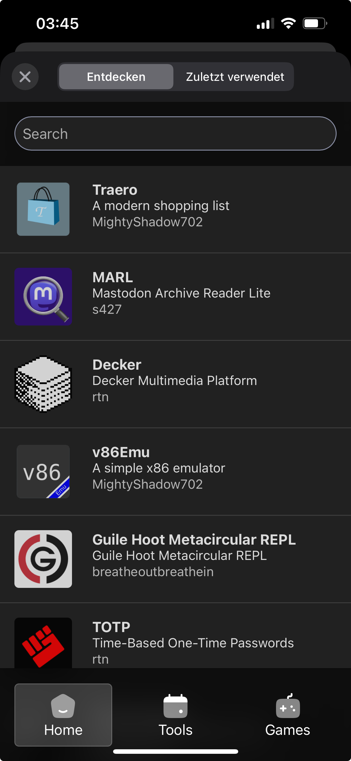
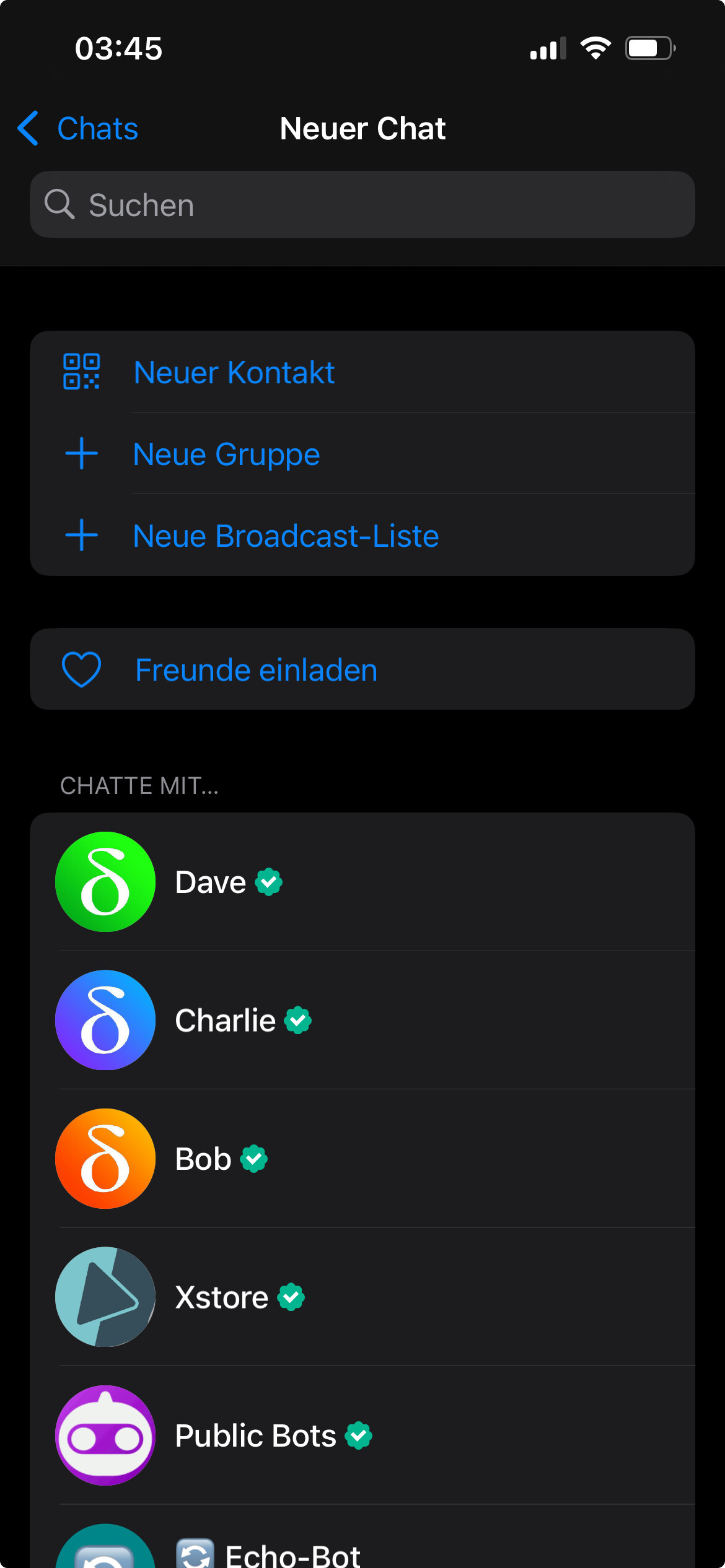
Place the “invite friends” button above the contact list:
The more contacts are added over time, the further down the “invite friends” button moves.
This means that users have to scroll further and further down to send an invitation to non-DC users. This is also possible in the settings, but I think it’s more intuitive for most people to search for it in the “New Chat” screen first.
More transparent input bar:
I think it would make the chat history appear larger if the input bar, without the input field, were as transparent as the title bar.
Opening a chat would likely also benefit visually, because after the chat moved from the right into view, the transparency of the input bar would no longer be suddenly reduced. This would be especially noticeable in dark mode.
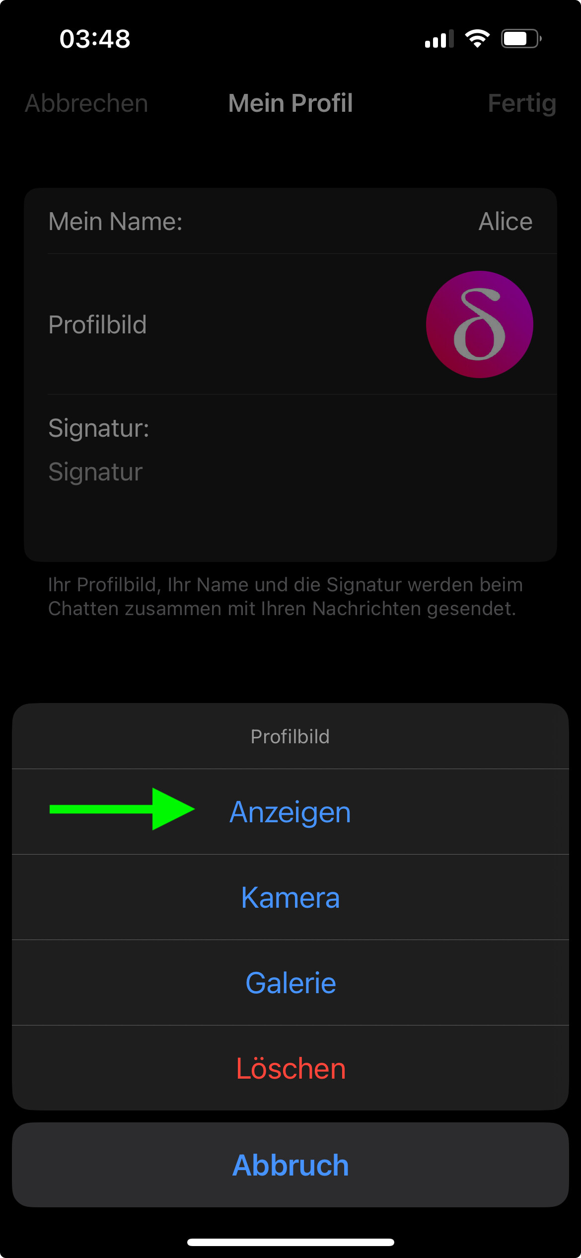
Full-screen display of own avatar:
In my opinion, it would make sense to be able to see your own avatar in full screen to better judge how it looks to contacts who view it in full screen mode via the contact details screen.
Close keyboard by tapping on the chat:
I think closing the keyboard with a tap is more intuitive and also a bit faster. This is also the case in most iOS apps. Close keyboard by tapping on the chat
Reduce the empty space at the bottom of the speech bubbles:
If the empty space at the bottom of the speech bubbles were as small as in DC-Android, it would save some screen space and improve the appearance of the chat due to a better ratio between text and space in the speech bubbles. Reduce the space between the bottom line of text and the date
Enlarge avatars slightly:
In my opinion, it would improve the appearance a bit, especially on larger phone screens,
if the avatars in the chat list and settings menu had a diameter of 168 pixels.
Many messengers like WhatsApp, Threema, and Signal use this width.
thanks for the detailed suggestions! most of them make sense.
for “more transparent”, iirc, it is just what the system provides, and tbh, we’re pretty happy that that area got stable for “invite friends” above chatlist: yes, maybe. but more important is to redo the “add contact” screen similar to android, make it more clearer that one can share an “invite link” from there. having then two “add contact” is probably even more confusing. the item in the contact list is more a temporary, ad-hoc thing