A long “most recent” chat list suffers from conflicts between presenting “high frequency, lower importance” and “low frequency, high importance” chats (e.g. important chats can get buried by unimportant stuff).
But it should be possible to solve the problem decently within a single client.
Possibly simply by adding two separator lines to the chat list that indicate three “importance blocks” (only showing if corresponding chats exist).
By default: list 1-to-1 chats in the first block, up to 1-to-6 group chats in the middle, and larger group and mailinglist chats in the lower block
If the overall number of unread chats does not fit on the screen, automatically reduce the first and second blocks to 1/3 of the display height as minimum by default, to always provide an overview over the first three importance blocks (showing the first couple of chats waiting to be read).
Use more height for the first and second block if available (i.e. other blocks have less unread chats).
Allow the user to resize the blocks to take more space. (Breaks providing an overview over three blocks without scrolling the listing.)
Make the first and second (shortened) blocks scrollable independently.
Allow to move chats manually into another block.
Allow to switch the sort order of the individual blocks between latest, oldest, alphabetic and custom (fixed).
(A mock-up from the discussion below:)
This should keep important chats visible and reliably sorted without getting disturbed by the activities in other importance blocks. The chats further down the list (not shown without scrolling) will automatically rise up when returning to (reloading) the chat list after reading a chat.
Nice but not matching, because at banquets the attention is mostly directed to those nearby, and barbecue groups may also talk very much.
Its a good example, showing how a not-matching inadequate metaphor, is not helping to find any solution, but may foster a polarized conclusion. (To fork the whole application in two, instead of just splitting the chat list into three auto-adjusting blocks.)
IMHO reducing the blocks to 1/3 of the display height as minimum by default might probably make the DC UI unclear. Three scrollable lists stacked simply are too much on small displays.
I.e. sort the messages by a computed number:
The more often the user looked into a chat or even wrote something recently & the more recent the newest message -> the higher the number.
The more members in a group -> the lower the number. (I think that you made a good point that there is often a lot of noise from groups with a lot of members)
Maybe also make it possible to star chats, which also increases the number.
But somehow try to generally show unread chats on the top & show at most, like, 2 read (but more frecent) chats among them.
I don’t have any experience if a computed value like the “frecency” makes sense for a list one needs to keep track of, since items may move or stay up or low in unclear ways.
Using 1/2 or 1/3 of the display for each block was only meant as the default, to make sure the user notices that there are actually two or three scrollable blocks, once the number of active chats in differenrent “importance blocks” increases above the number of chats that can be displayed on a single screen.
In practice I thought the user would then adjust the size of the blocks, similar to how the size of the editor window in this form can be increased to edit a longer post (but keeping the elongated boxes scrollable overall (not fixed to the top or bottom) and within).
The boxes that get “scrolled” out of the screen may actually be displayed as collapsed, and all the time continue to indicate whether they contain unread messages.
You’re right, that’s a problem. I tried to (partly) address it with:
But still, a computed value may fit for the user’s needs, or may not.
Yet another idea: Make two tabs, one for groups and one for 1-1 chats. Problem: If the user has only, like, five active chats, this is unnecessary and overcomplicates it.
And a third idea (just brainstorming): Let the user mark a chat as “unimportant”, which moves it to an extra tab (if no chats are marked “unimportant”, there are no tabs, either). If the user has at least three groups with a lot of messages, ask whether he/she wants to mark them as “unimportant” and tell him/her where the three groups have gone.
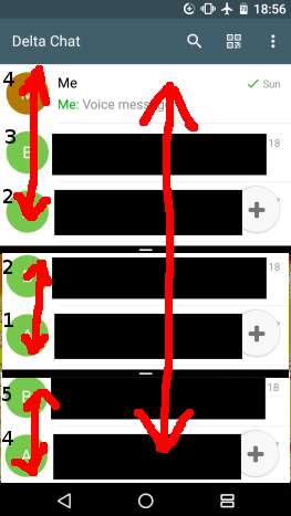
Using the new Android split screen feature you can see about how your idea would look (just imagine tow more lists): (if I understood everything correctly)
I had also thought about tabs before but found the overview they provide is limited (only one tab at a time) and
on a sigle page view one can get a more complete picture at a single glance.
Android’s split screen mode is not quite it yet, it is missing overall scrolling.
Within the importance blocks I think it would be good to (of course) list the chats with unread messages before those already read, and to sort the unread chats by the oldest unread message first (chronological). Then chats with a newly arriving message will queue up below, and reading the first message in the chat list (that waits the longest) will automatically bring up the next chats in the “importance block” when returning from chat view to the chat list.
Scrolling the chats should be possible overall and within the importance blocks. Maybe like this:
I am not sure whether it would be best to list all “read” chats together below all (reading) importance blocks, or to keep them within the blocks, by default.
Listing all already read chats together below all “reading importance blocks” (possibly in alphabetic or custom order to make locating a chat (contact) consistent) could make using the in-block scrolling mostly unnecessary in the day-to-day use.

 )
)